divided roughly half an NBA court (from the baseline to just past the 3-point line) into 1,284 "shooting cells." Then he plotted every shot taken in an NBA game from 2006 to 2011, and color-coded the results. The areas which yielded the most points per shot appear near the red end of the color spectrum; those that yielded the fewest are at the blue end.
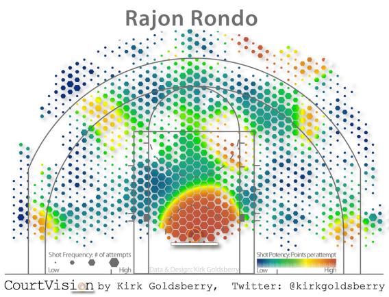
And this kind of visualization becomes even more useful when you switch from the general to the specific. Goldsberry sent me a map he created tracking the shots of my favorite player, Boston Celtics point guard Rajon Rondo. The hexagons that represent each shooting area are larger where Rondo shoots a lot, smaller where he doesn't. And while the image echoes the league-wide results, it also reveals some personal idiosyncrasies—such as the fact that Rondo, a poor outside shooter for the most part, actually has one sweet spot when it comes to three-pointers.
From a map like this, a player can quickly learn both where he should try to shoot during a game (the red spots) and where he should shoot during practice (the blue spots). A coach, meanwhile, could layer the equivalent map for each one of his players on top of one another and find in the visual data inspiration for new plays that lead each man to one of his sweet spots. And for the mere fan, such maps can not only lead to a greater understanding of the game, but also provide at least a hint of the aesthetic pleasure that makes basketball enjoyable in the first place. As Michael Scott might say, win-win-win.
 Topic: Rondo shot heat map from 2006-2011 (Read 5507 times)